

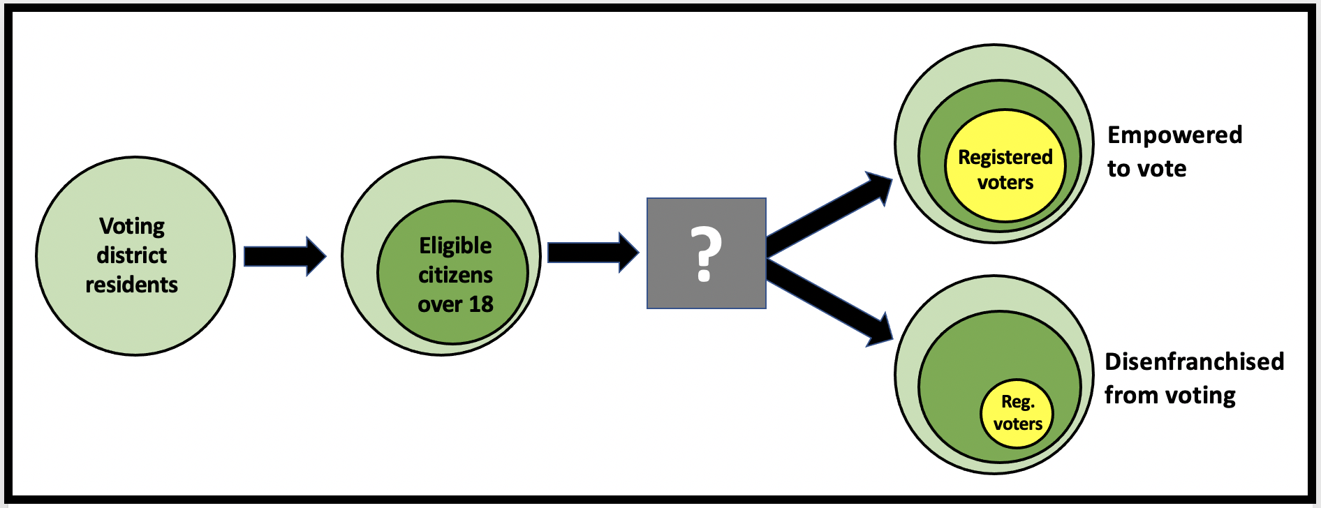
Which counties have the most unregistered voters? How does a county’s racial composition impact how many residents get to vote? Where should organize focus to increase voter registration and turnout?
Savvy organizers create maps with U.S. Census, voting data and county specific information to decide where to focus their voter mobilization efforts. What is the population of a county? How many of the residents are eligible to vote? Compare this to the actual number of registered voters in that county? The answer indicates the number of potential unregistered voters in that county. Extra credit to see how the predominant race in that county impacts the degree of voter suppression.
Logic design by Kati Hornung and Kate Bird with Center For Common Ground
Converting the idea into a practical solution
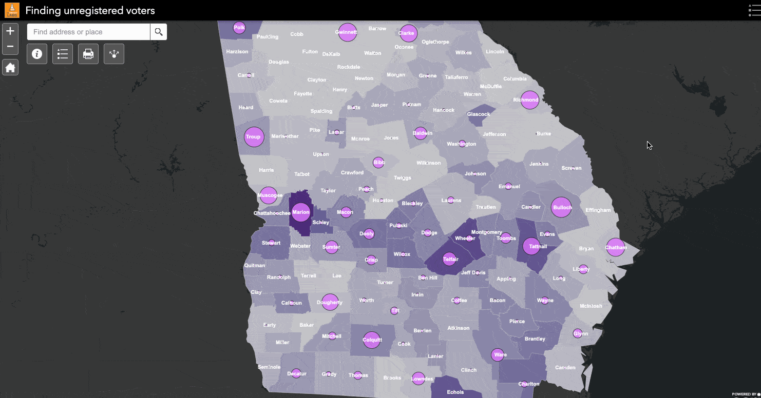
Converting Katie and Kate’s idea of finding unregistered voters needed data, software and volunteer help. The map uses publicly available data including the 2018 ACS updates to the census and details of the number of registered voters per County from the Georgia Secretary of State. DemLabs volunteers used ArcGIS Online to create a map with this information.
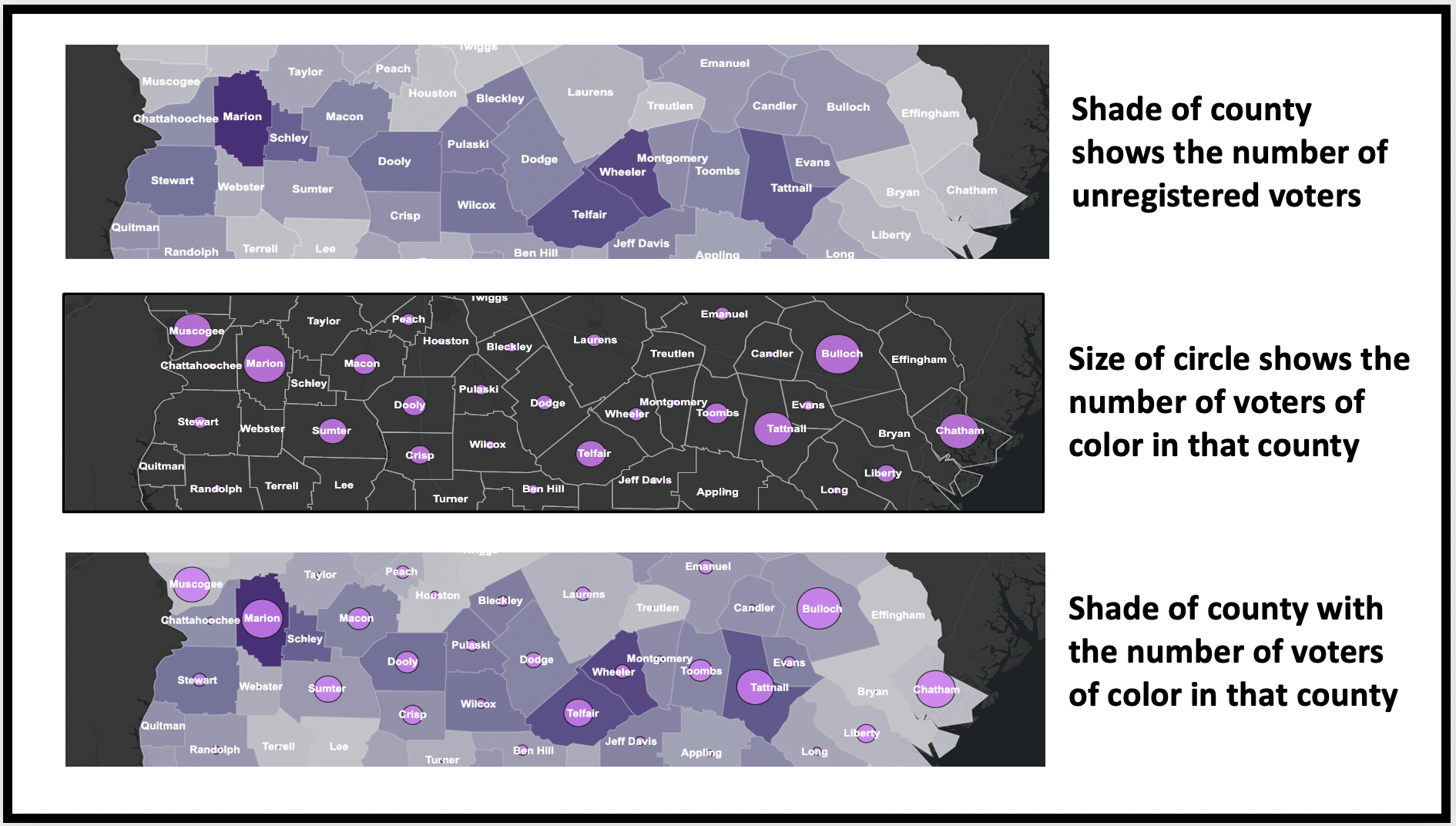
This map shows county boundaries, the population of a county, the number of registered voters and the level of disenfranchisement. The darker the color the greater the level of disenfranchisement and the more potential unregistered voters. A rate of 0.25 indicates one out of four eligible voters are disenfranchised. The number of potential unregistered voters in communities of color (CoC) are shown as pink circles. The bigger the circle, the more potential unregistered voters there are in that county.
I can see clearly now…
Maps make it easy to understand a lot of data at a glance. How do you design a map so that it is both detailed but understandable? We chose to show counties in different shades of purple to indicate the level of voter disenfranchisement. At a glance you can see that the rural counties in southern Georgia ( Marion, Schely, Macon, Wheeler, Telfair) have a large number of unregistered voters. The map shows the number of potential unregistered voters in a county as a pink circle. The size of the circle is bigger in counties with more unregistered voters of color. Details for each county are presented in a pop-up window. Clicking on Marion county for instance reveals:
Marion County
ANALYSIS: There are potentially 4,664 unregistered voters of color, a disenfranchisement rate of 72.81%
2018* This county’s population was 13,480, of which 8,775 were people of color. Of these, an estimated 9,840 would be eligible to vote, of which 6,406 are people of color. (* 2018 population and eligible voter estimates are based on the 2018 American Community Survey 5-Year Estimates. Each county is likely to have a larger population today, since Georgia is growing rapidly.)
2020. Records show 4,922 registered voters, of which 1,742 are voters of color per the Georgia Secretary of State.
Take Away
Target your efforts better with data-rich maps. This map shows that many rural Georgia counties with large communities of color have more voter disenfranchisement. Targeting these counties will have a better rate of return than others with fewer unregistered voters.


