

Driven by Dollars: Automaker CEOs’ Lucrative Layoff Strategies
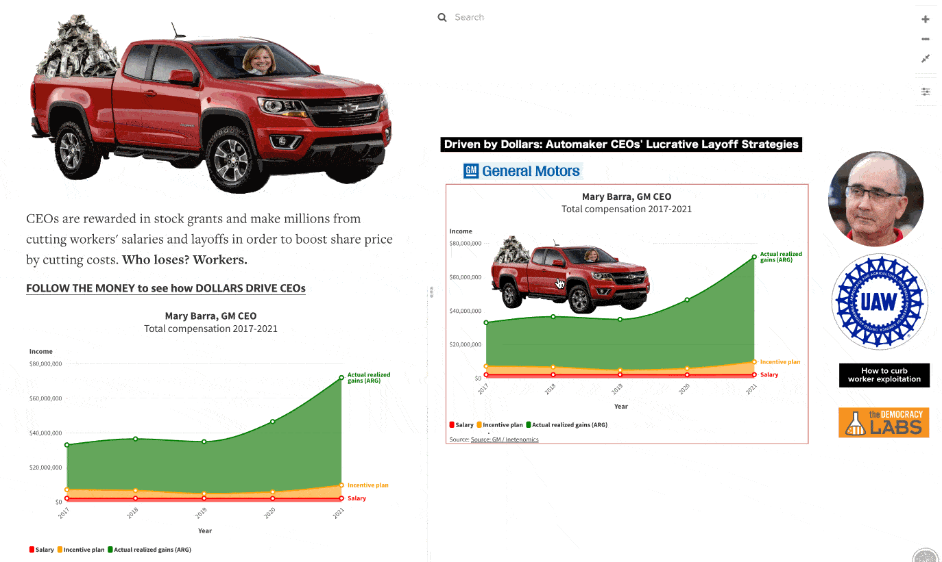
Automaker CEOs make millions by cutting workers’ salaries and layoffs.
Follow the money to understand how the scheme works. Execs are given stock grants and options. They make a lot of money as the share price goes up. How do you goose share price? Cut costs. Cut healthcare benefits for workers. Lay off workers. Share price goes up. Execs drive off with millions. Who loses out? Workers.
That’s it in a nutshell. Read this excellent article “What the UAW and Everyone Else Need to Know About CEO Pay” for more details.
How do you take an issue and explain it simply so more people can understand how they are being exploited? Especially when high paid corporate accountants try to bury the facts in a lot of geek speak? Check out this relationship map and then I’ll explain how I created this infographic in a few hours using four free apps.
Cut through corporate B.S.
I started with this article What the UAW and Everyone Else Need to Know About CEO Pay by Matt Hopkins and William Lazonick. It’s a really good article, but takes time to read and understand. That isn’t ideal if you’re in a hurry.
I used the free Kumu app to create this infographic. It’s meant to be a VERY simplified explanation with embedded links for more details. It is interactive. You can click on any part of the infographic (such as Mary Barra, Shawn Fain or the UAW) for more details. You do not have to read the infographic sequentially as you would a written article.
Make it visual
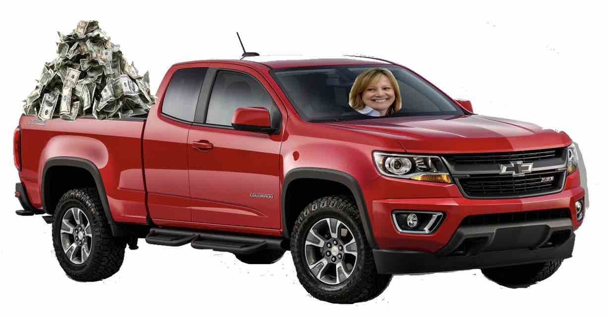
I designed this image of Mary Barra, the CEO of General Motors driveing a Chevvy pickup with a pile of cash in the back. The picture captures rampant corporate greed without any words. I used the free LunaPic app to edit the picture along with the ‘Transparent Background’ feature.
Keep it simple
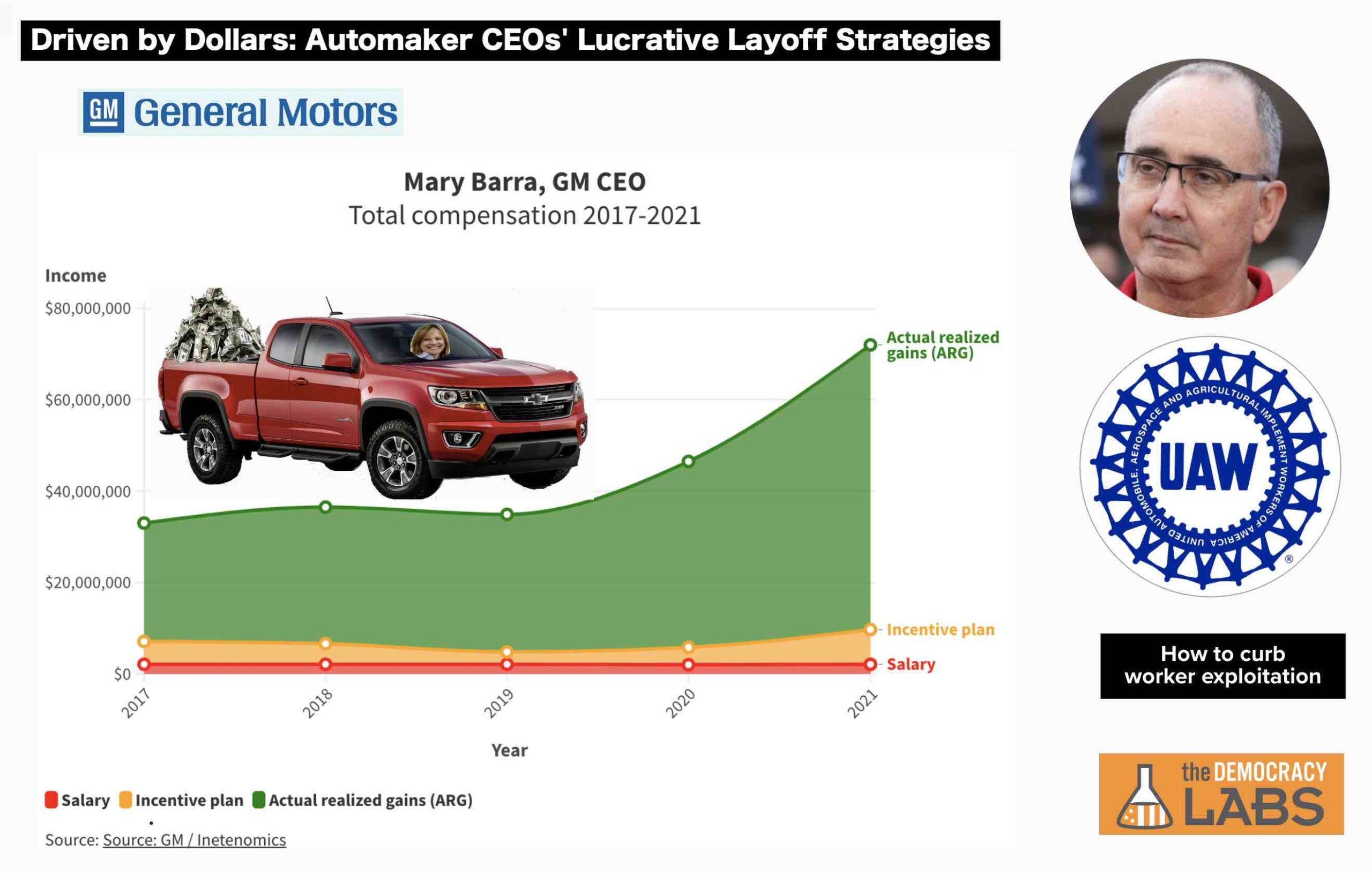
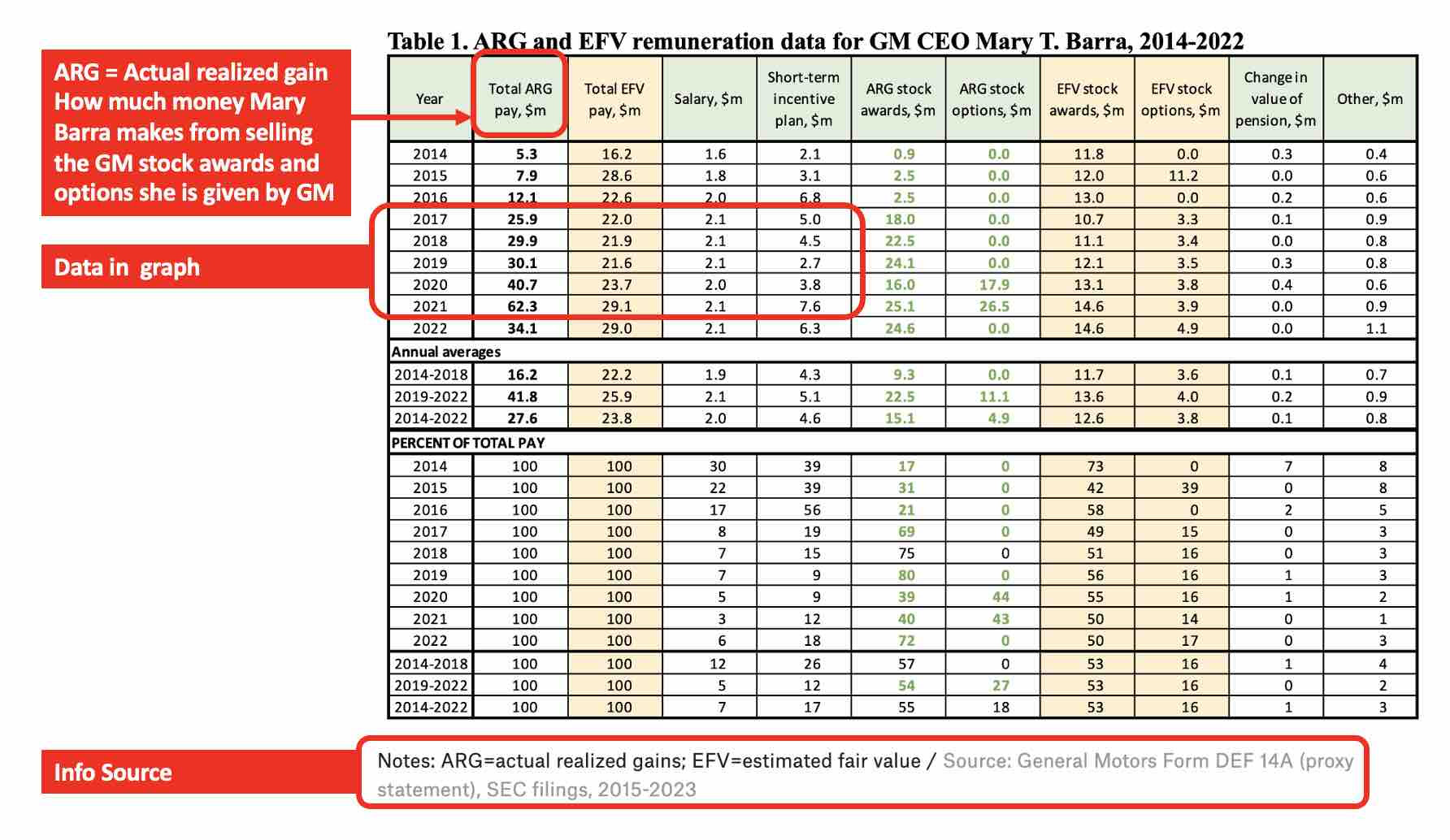
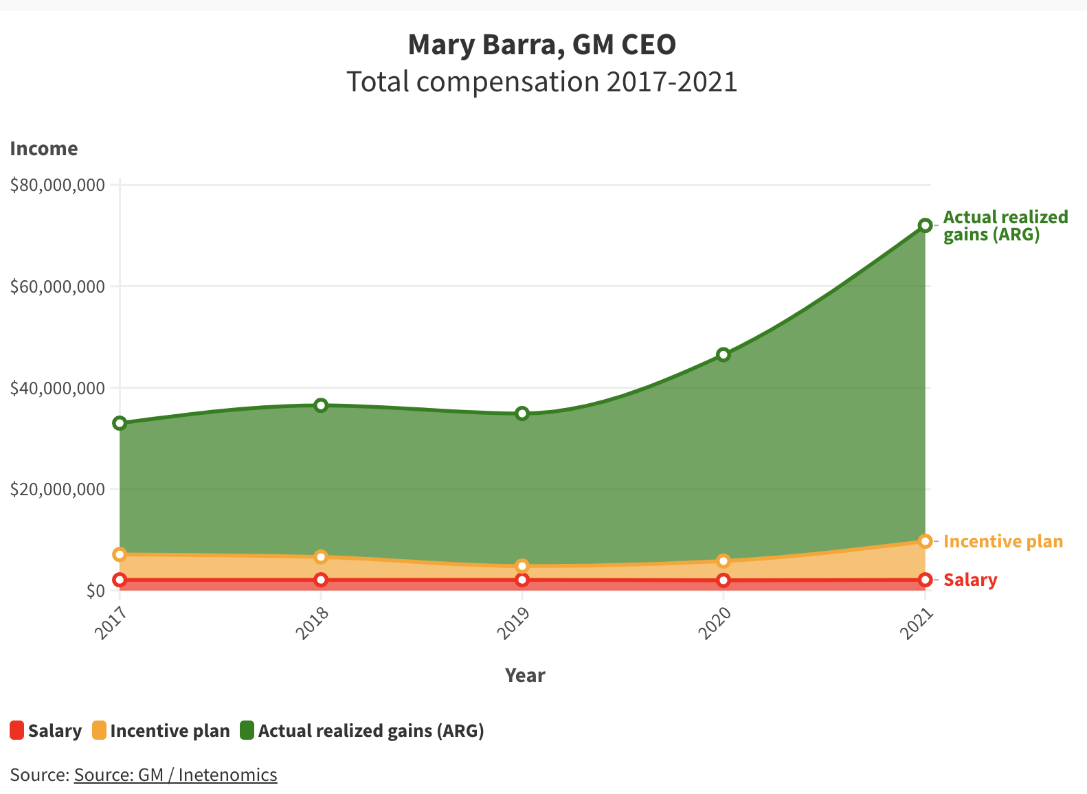
People are busy and distracted. A chart full of numbers like this is hard to understand. I wanted to draw attention to the millions of dollars Mary Barra is making through “Actual Realized Gains” so I chose to graph only a small portion of the data. I used the free Flourish app to create an interactive graph. Click on the graph for details on how much money Mary Barra made every year and how much of it was through ARGs. Flourish allow you to embed the graph in a website or print it out. Contrast the graph below with the table above.
A little humor never hurt
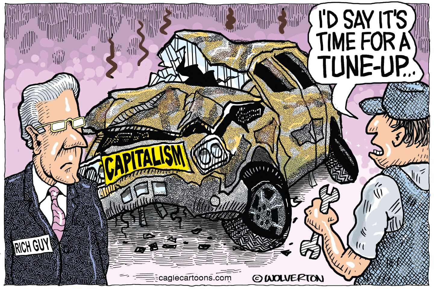
Corporate greed, layoffs, exploited workers… are all serious topics. Use cartoons to lighten up your story, while still making a point. I used this cartoon from Political Cartoons in the relationship map. I used the free ezGIF app to create the introductory GIF.
TakeAway: Follow the money behind corporate greed that’s exploiting workers. Use free storytelling apps to make it easier for others to understand as well.
Deepak
DemLabs
This Relationship Map can be freely shared with this link https://embed.kumu.io/668177daf62212faf46e5e3a934a1577
DISCLAIMER: ALTHOUGH THE DATA FOUND IN THIS BLOG AND INFOGRAPHIC HAS BEEN PRODUCED AND PROCESSED FROM SOURCES BELIEVED TO BE RELIABLE, NO WARRANTY EXPRESSED OR IMPLIED CAN BE MADE REGARDING THE ACCURACY, COMPLETENESS, LEGALITY OR RELIABILITY OF ANY SUCH INFORMATION. THIS DISCLAIMER APPLIES TO ANY USES OF THE INFORMATION WHETHER ISOLATED OR AGGREGATE USES THEREOF.
Read in browser »
Reposted from Democracy Labs with permission.


