

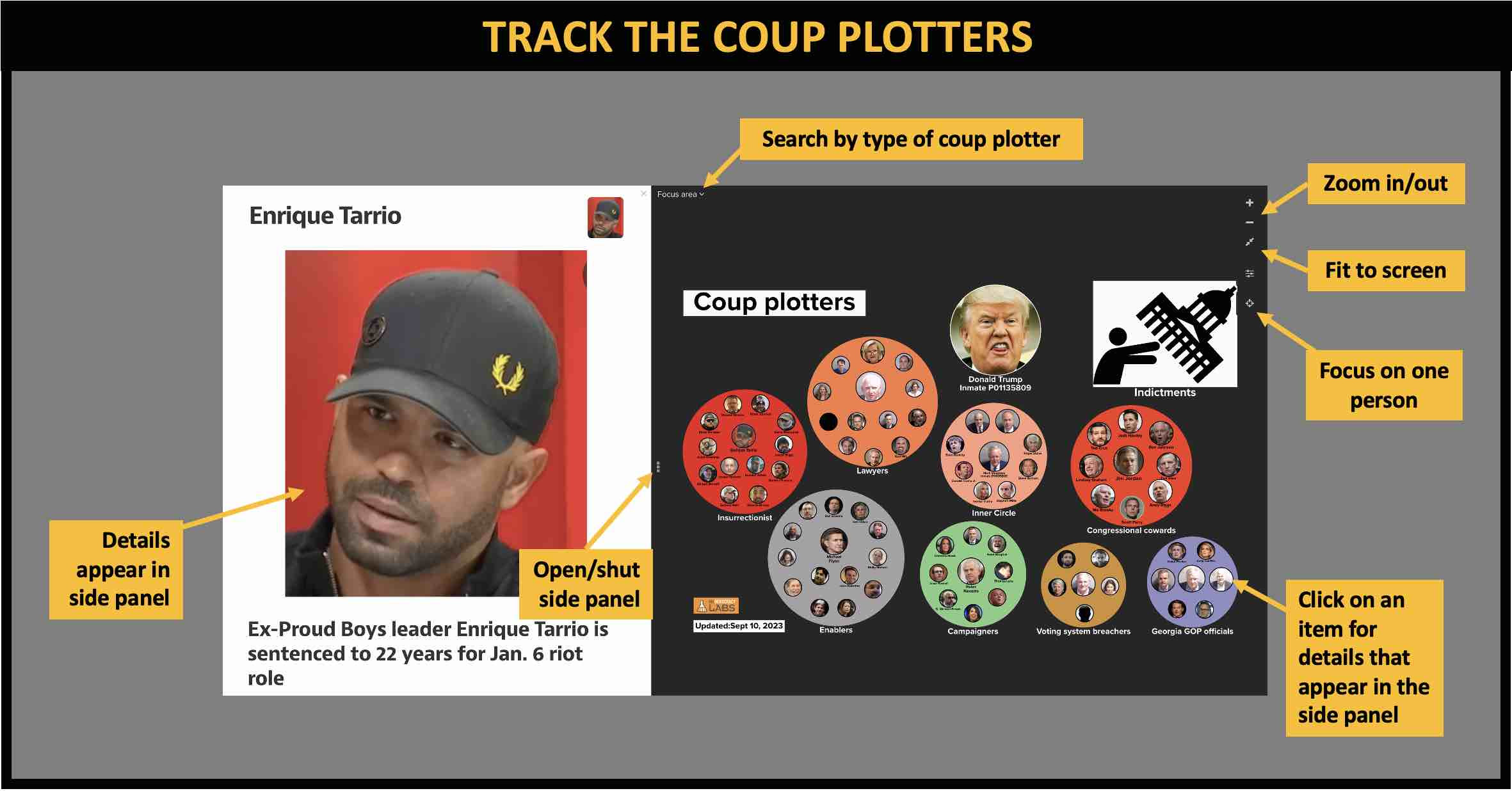
Charting the Coup Plotters: A Visual Relationship Map
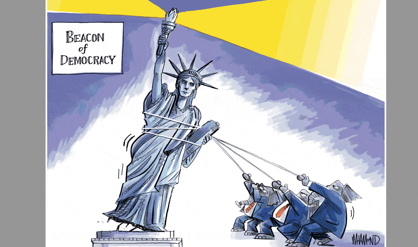
How do you track of the coup plotters behind the scheme to overthrow American democracy?
Indictments provide a lot of details, but understanding all the facts can be confusing. That’s where relationship maps come in handy. Such maps make it possible to get the big picture and then dig in for details which can include text, images, audio files and videos. People in relationship maps can also be clustered into groups making them easier to explore quickly. The maps are online and can be updated with new people and dates as they are exposed.
The Key Players in Trump’s Plot to Upend the Election, Mapped
“Upending the outcome of a free and fair presidential election is no minor endeavor. It requires time, energy, money and, especially, an awful lot of people willing to do the wrong thing — or at least go along with it. This NY Times infographic the organizes the coup plotters into groups making the information easier to follow. But, it does not provide details behind a person in the diagram.
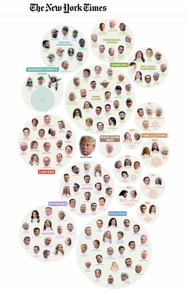
The network of people who allegedly helped Donald Trump try, without success, to stay in power more than two and a half years ago may seem hopelessly chaotic, but there was a method to the madness. American elections are, by design, entrusted to the states and therefore decentralized.
To meddle in them requires national masterminds working hand in glove with plotters at the state and local levels — a tangle of conspirators, enablers and indulgent bystanders as messy and sprawling as our democracy itself. – NY Times
Relationship maps
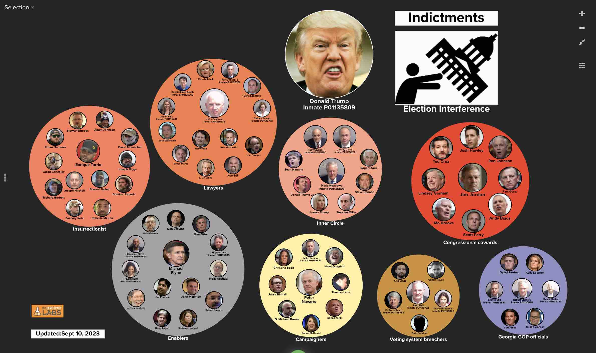
This relationship map can be shared with this link https://embed.kumu.io/9d5028733dac46d5ca4aafd63ad5b16f or embedded in a website with this code “<iframe src=”https://embed.kumu.io/9d5028733dac46d5ca4aafd63ad5b16f” width=”940″ height=”600″ frameborder=”0″></iframe>”
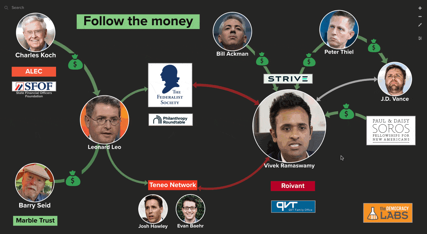
DemLabs uses the free Kumu app to create relationship maps. These maps help organize information visually so it is easy to understand and share. Clicking on an individual reveals more details in a side panel. Relationships between individuals are shown as lines. Relationship maps are also ideal for helping ‘follow the money’ between individuals such as this map about Vivek Ramaswamy.
“As you consider the following bubbles, filled with so many of those who did his bidding in the dark days after his 2020 defeat, remember that even if he loses, many of these individuals will probably remain an important part of the national and state political scenes for years to come. Which is why a thorough accounting of their actions is so necessary.” – NY Times
TakeAway: Follow the coup plotters and their scheme to overthrow American democracy. Use relationship maps to help others recognize the threat too.
Deepak
DemLabs
DISCLAIMER: ALTHOUGH THE DATA FOUND IN THIS BLOG AND INFOGRAPHIC HAS BEEN PRODUCED AND PROCESSED FROM SOURCES BELIEVED TO BE RELIABLE, NO WARRANTY EXPRESSED OR IMPLIED CAN BE MADE REGARDING THE ACCURACY, COMPLETENESS, LEGALITY OR RELIABILITY OF ANY SUCH INFORMATION. THIS DISCLAIMER APPLIES TO ANY USES OF THE INFORMATION WHETHER ISOLATED OR AGGREGATE USES THEREOF.

Reposted from Democracy Labs with permission.


